Use More System Fonts
Choosing which typefaces to work with, is one of the most impactful decisions a designer makes when starting a new project. For the web, this usually means looking thru Google Fonts, or Adobe Typekit, or some other online type foundry to find the perfect web font.
For years, I assumed I had to use a web font for all web projects because no serious person would even consider using system fonts. I think most designers have a similar attitude and are often too quick to reach for web fonts. Web fonts are great but there are also benefits to using System Fonts which are often overlooked.
Web or System
Web fonts are files (i.e. woff or woff2) that the browser has to download before it can properly render the page. The more font families and fonts weights needed, the more requests and more data the browser has to download. Loading web fonts can slow the initial page load or worse cause FOUT (Flash of Unstyled Text).
Perhaps your brand has established typographic guidelines, in which case you need to use specific typefaces which are likely only available as web fonts. In that case, you can improve load time and avoid FOUT by preloading the font file using rel="preload", like so:
<link rel="preload" href="/fonts/atkinson-regular.woff" as="font" type="font/woff" crossorigin />
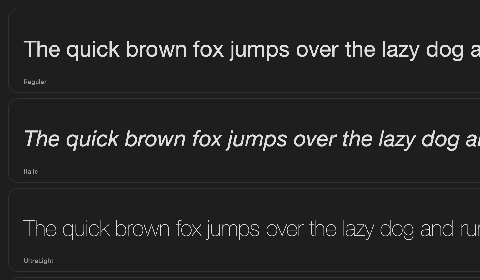
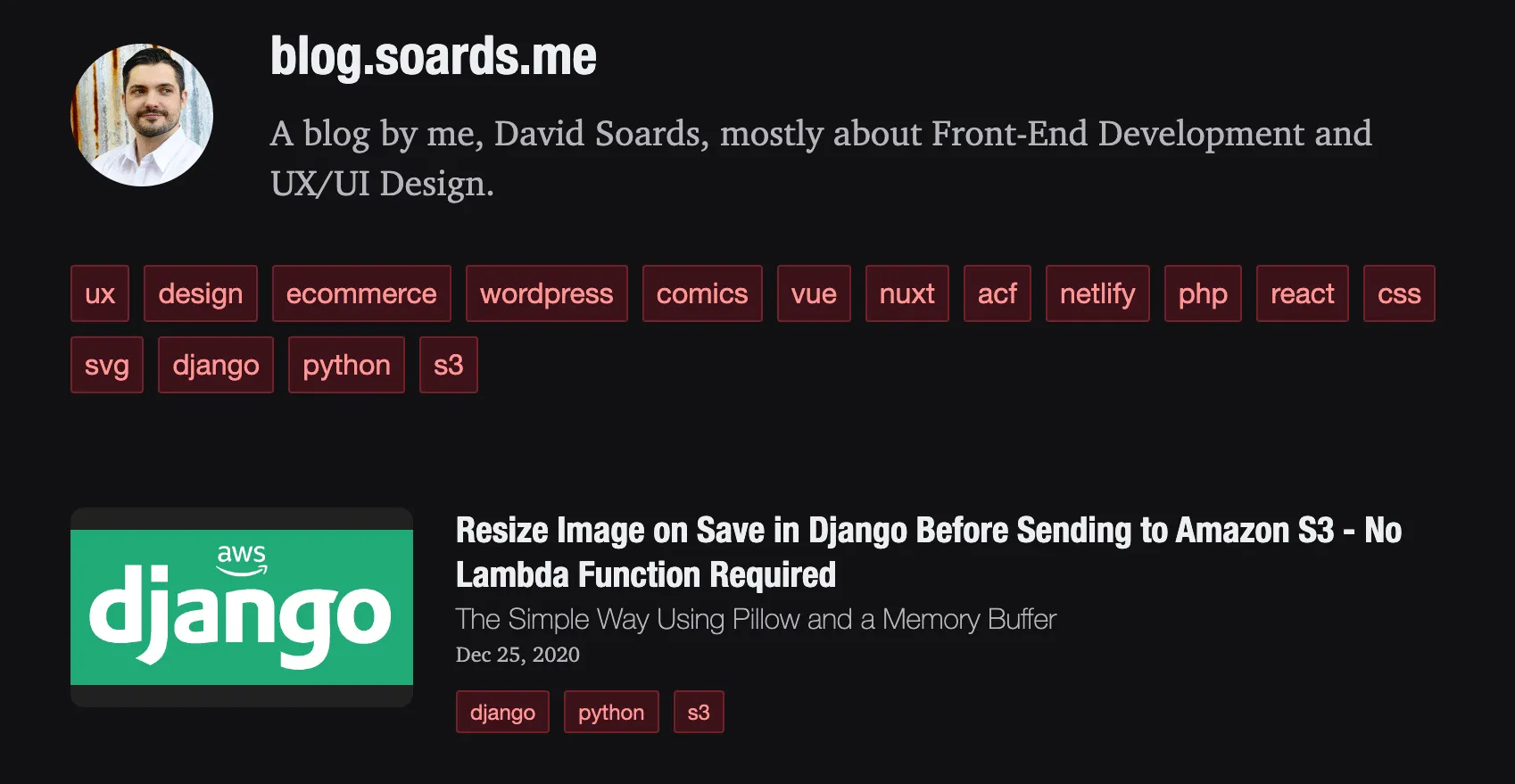
If brand guidelines aren’t a concern, I encourage you to at least consider using System Fonts. When I recently re-designed this blog, I made the conscious decision to forgo using any special web fonts and instead use good ol’ system fonts. For body text I chose Charter and for headings I went with Helvetica Neue Condensed Bold and Helvetica Neue.
Charter is a great looking serif font designed by Matthew Carter, who later designed Georgia and Verdana also. At the time, it was designed for low resolution printing, and as a side effect it works nicely on screens.
Helvetica is an absolute classic. They even made a movie about it. It’s used in logos for many of the biggest brands in the world. I figure it’s good enough for my little blog.
Font Stacks
“But, David, those fonts are only available on MacOS!”
It’s true, and consistency is one of the strongest arguments for using web fonts. The exact same font file will get loaded on every machine. But much like the layout of a responsive website is different at different screen sizes, your typefaces don’t necessarily need to be exactly the same on every system either. They just need to be cohesive with one another and look good in context. By using a font stack in your CSS, you can ensure that different Operating Systems will use different but appropriate fonts.
Tailwind’s default config has excellent font stacks for font-sans, font-serif, and font-mono. On most of my side projects, I just use the font-sans system font stack. It ends up rendering SF Pro on Mac, Segoe UI on Windows, and Roboto on Linux. And I actually like the fact that the typeface in my web app ends up matching the typeface used in the Operating System.
/* font-sans */
font-family: ui-sans-serif, system-ui, sans-serif, 'Apple Color Emoji', 'Segoe UI Emoji', 'Segoe UI Symbol', 'Noto Color Emoji';
With a web font, I typically limit myself to 2 or 3 weights at most, in order to reduce the amount of data that needs to be downloaded to the browser, but another advantage to using the system-ui font is that I have access to all of the available weights Thin to Black.
For this blog I modified the tailwind.config.js a bit to use Helvetica and Charter before falling back to the default font stacks.
// tailwind.config.js

export default {
  theme: {
    extend: {
      fontFamily: {
        cond: ['HelveticaNeue-CondensedBold', 'Helvetica Neue', ...defaultTheme.fontFamily.sans],
        sans: ['Helvetica Neue', ...defaultTheme.fontFamily.sans],
        serif: ['Charter', ...defaultTheme.fontFamily.serif],
      },
    },
  },
};
Comparison
If you are reading this blog on Windows (and you don’t have Helvetica and/or Charter installed) you will see Georgia for body text and Segoe UI for headings, which is also a nice combination IMHO.
Below is the same screen on different systems.
Mac

Windows

Although I prefer the Mac version, both versions work well and are quite readable.
Conclusion
In conclusion, system fonts are underrated. Use more system fonts!