Simplify Dark Mode w/ Radix Colors & Tailwind
I’ve been using Tailwind CSS both at work and on side projects for a few years now, and it has become one of my favorite tools. The defaults it provides, such as the color palette, and text sizes, are fantastic and more than adequate for most projects, but it’s also completely customizable if needed. It’s one of the first things I install on any new project I start. I don’t even consider not using it at this point.
But there is one aspect of using Tailwind that I’ve always been somewhat on the fence about, and that is the dark variant. As per the docs, the dark variant “lets you style your site differently when dark mode is enabled”.
A more standard approach to dark mode usually involves having a set of CSS custom properties (background color, text color, border color, etc.) and changing the values of those properties based on the currently selected theme. I’ve described that process in a previous post.
Tailwind’s dark variant requires you to set light and dark classes for every individual element. For example setting the background and text colors of an element looks like:
<div class="bg-gray-50 text-gray-900 dark:bg-gray-900 dark:text-gray-50">...</div>This approach provides maximum flexibility, but it’s pretty verbose and you end up repeating the same light/dark combinations over and over.
Radix
Enter Radix Colors. Radix is best known as a wildly popular library of primitives for React, but they have also released a “comprehensive color system for designing beautiful, accessible websites and apps.”
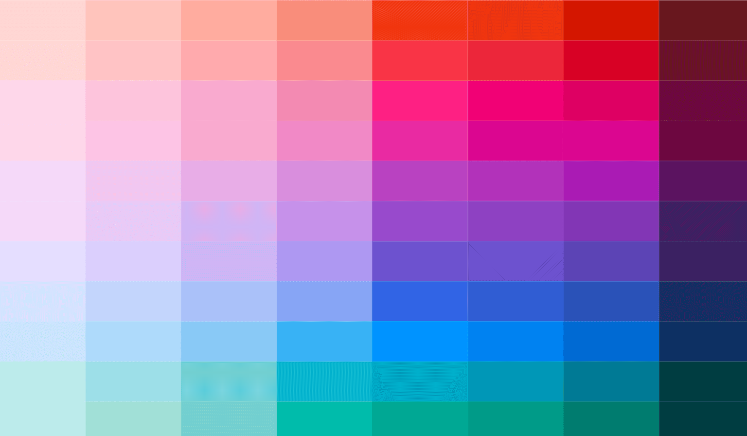
Radix Colors uses a 12 point scale where each step is designed for specific use cases. For example 1 is “App Background” and 12 is “High Contrast Text”. The best part about this system though, is that each color scale has a light and dark version. By applying a “dark” class to the <html> or <body> element, dark mode will “just work!” And because the system was designed with accessibility in mind, you can guarantee that you won’t have any contrast issues just by following the recommended applications.
Here’s how to set it up with Tailwind:
First, install Radix Colors. I’ll assume you already have Tailwind installed and setup for your environment.
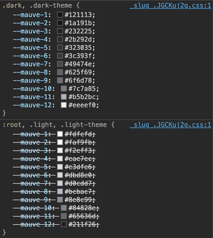
pnpm add @radix-ui/colorsImport the light and dark versions of the colors you are using in your main CSS file. Doing this gives you the the CSS custom properties. Each color has an opaque version and also a transparent version. I’m using the opaque versions only below. Alpha versions should be imported separately.
/* tailwind.css */

@import '@radix-ui/colors/red.css';
@import '@radix-ui/colors/red-dark.css';
@import '@radix-ui/colors/mauve.css';
@import '@radix-ui/colors/mauve-dark.css';
Now, if you open your project in a browser and inspect the <html> element. You should see the properties listed in the Style tab.
Create your Tailwind classes
In your tailwind config file, write a function to create a tailwind color object with values 1-12. A simple for loop will do the trick.
// tailwind.config.js

function getColorScale(name) {
  let scale = {};
  for (let i = 1; i <= 12; i++) {
    scale[i] = `var(--${name}-${i})`;
    // next line only needed if using alpha values
    scale[`a${i}`] = `var(--${name}-a${i})`;
  }

  return scale;
}
Now we can use that function to set the colors in our theme.
// tailwind.config.mjs

export default {
  darkMode: 'class',
  theme: {
    extend: {
      colors: {
        accent: getColorScale('red'),
        gray: getColorScale('mauve'),
      },
    },
  },
};
Setting background and text colors on a div as I did above will now look like:
<div class="bg-gray-1 text-gray-12">...</div>Using the Radix Color palette will take care of the majority of our dark mode concerns, but some overrides of the default behavior will likely be needed. And for those we can use the dark variant.
The Badge component used on this blog is a good example of using overrides. In dark mode the badge has a slight border and the background uses 2 with a 3 on hover, but in light mode there is no border and the background is a 3 with a 4 on hover.
<span
  class:list={[
    'font-sans inline-flex items-center rounded-sm bg-accent-3 px-2 py-1 font-base text-accent-10 ring-inset ring-accent-4 dark:ring-1 hover:bg-accent-4 dark:bg-accent-2 dark:hover:bg-accent-3',
    textSize,
  ]}
>
  <slot />
</span>
I really like this combination of Radix Colors doing most of the heavy lifting, and then handling “edge cases” with the dark variant.