Better references, better AI design
Bringing my own references and design decisions to an AI-assisted blog redesign.
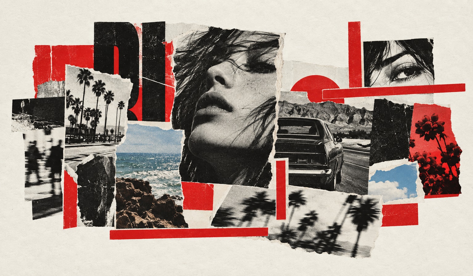
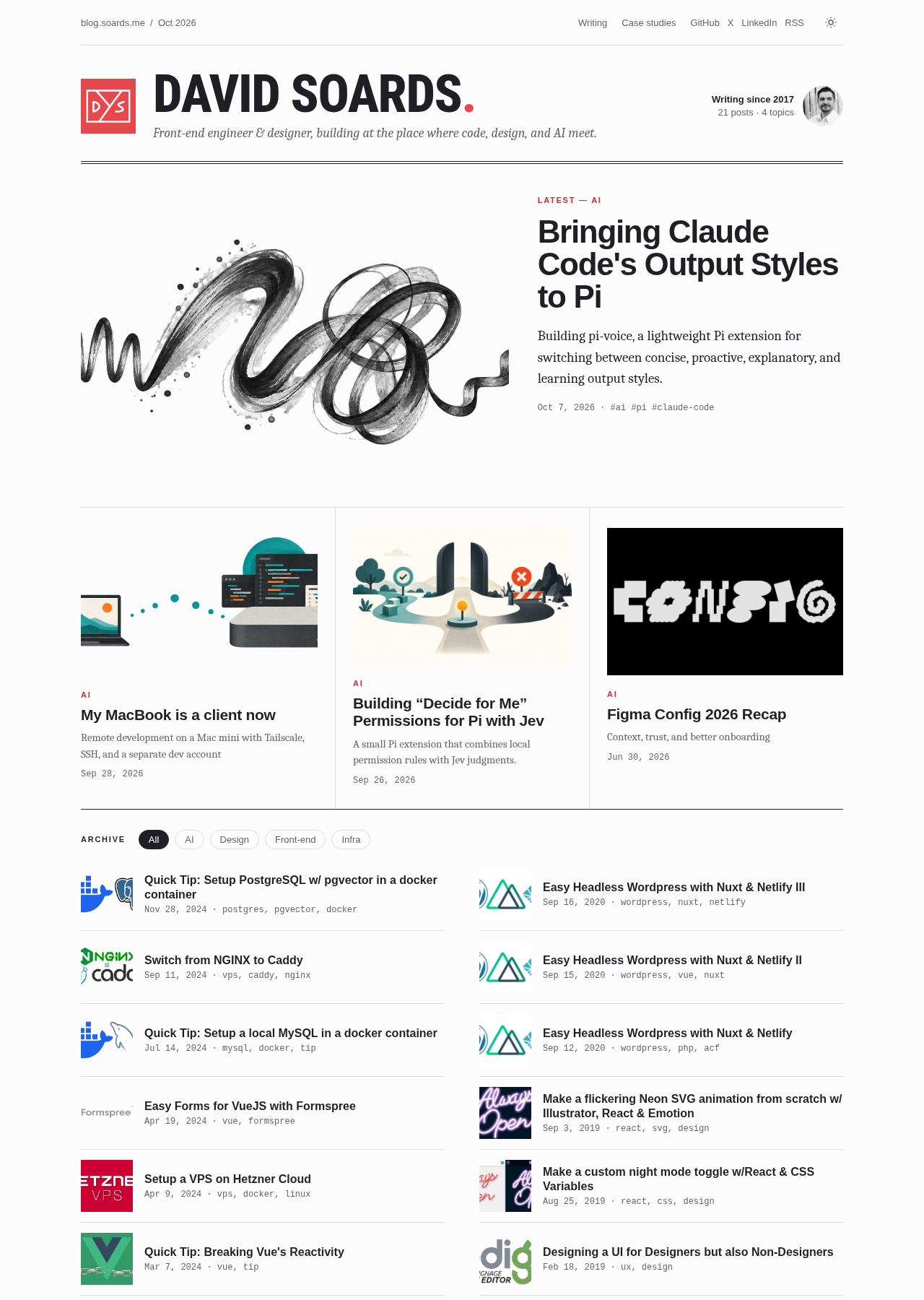
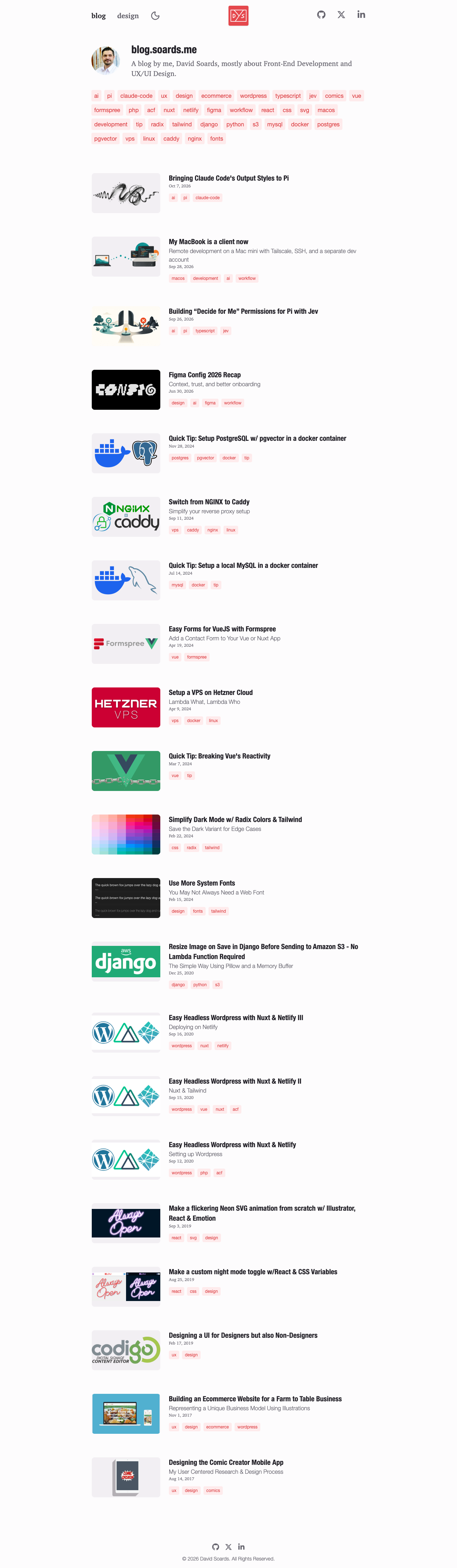
My blog used to be minimal on purpose. It used system fonts, a tag cloud that had gotten a bit busy, and a header with my photo that was supposed to look kind of like a social profile. I never quite liked how the header turned out. With the blog becoming more developer-focused, I wanted to rethink the design.
AI is part of how I work now, but a lot of people are cranking out boring, generic slop with it. I wanted this redesign to draw from classic print design and have more character. Before I asked for a mockup, I gave the agent photos of magazine pages and a book cover, as well as links to several sites and blogs that I liked.
The references
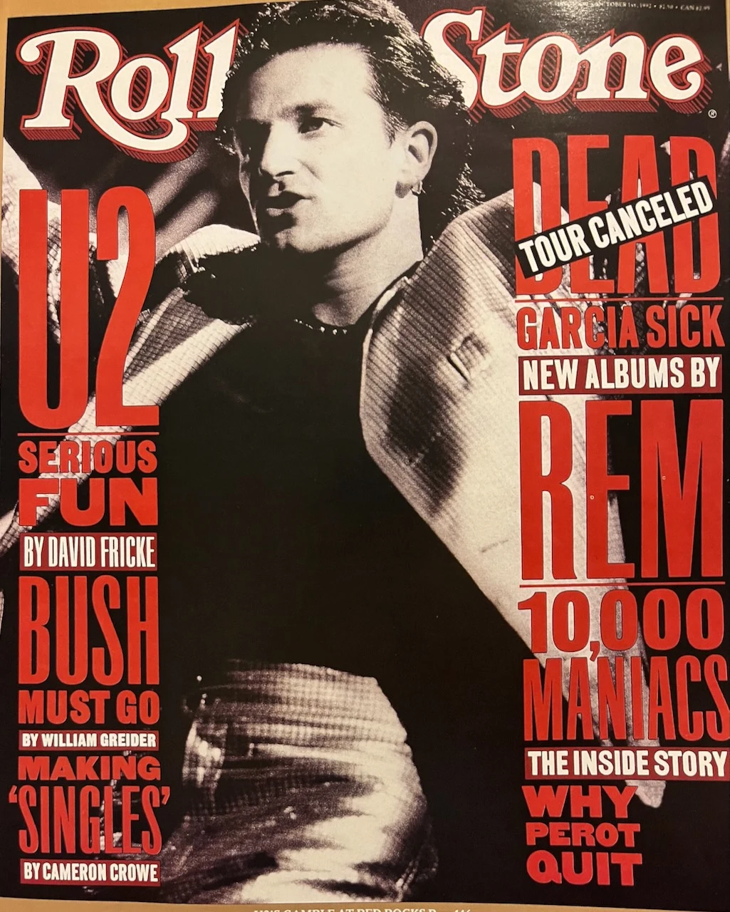
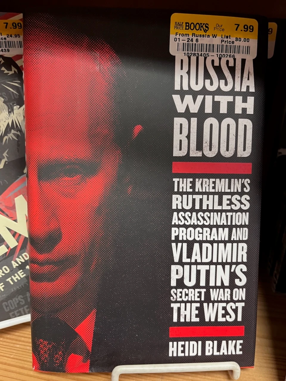
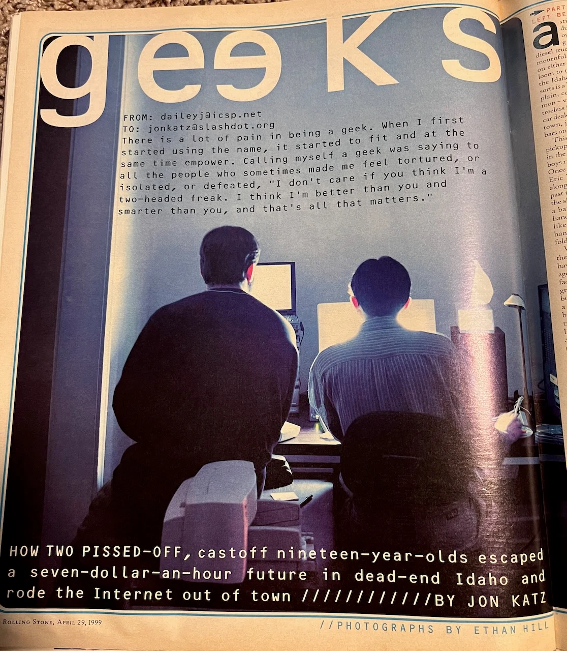
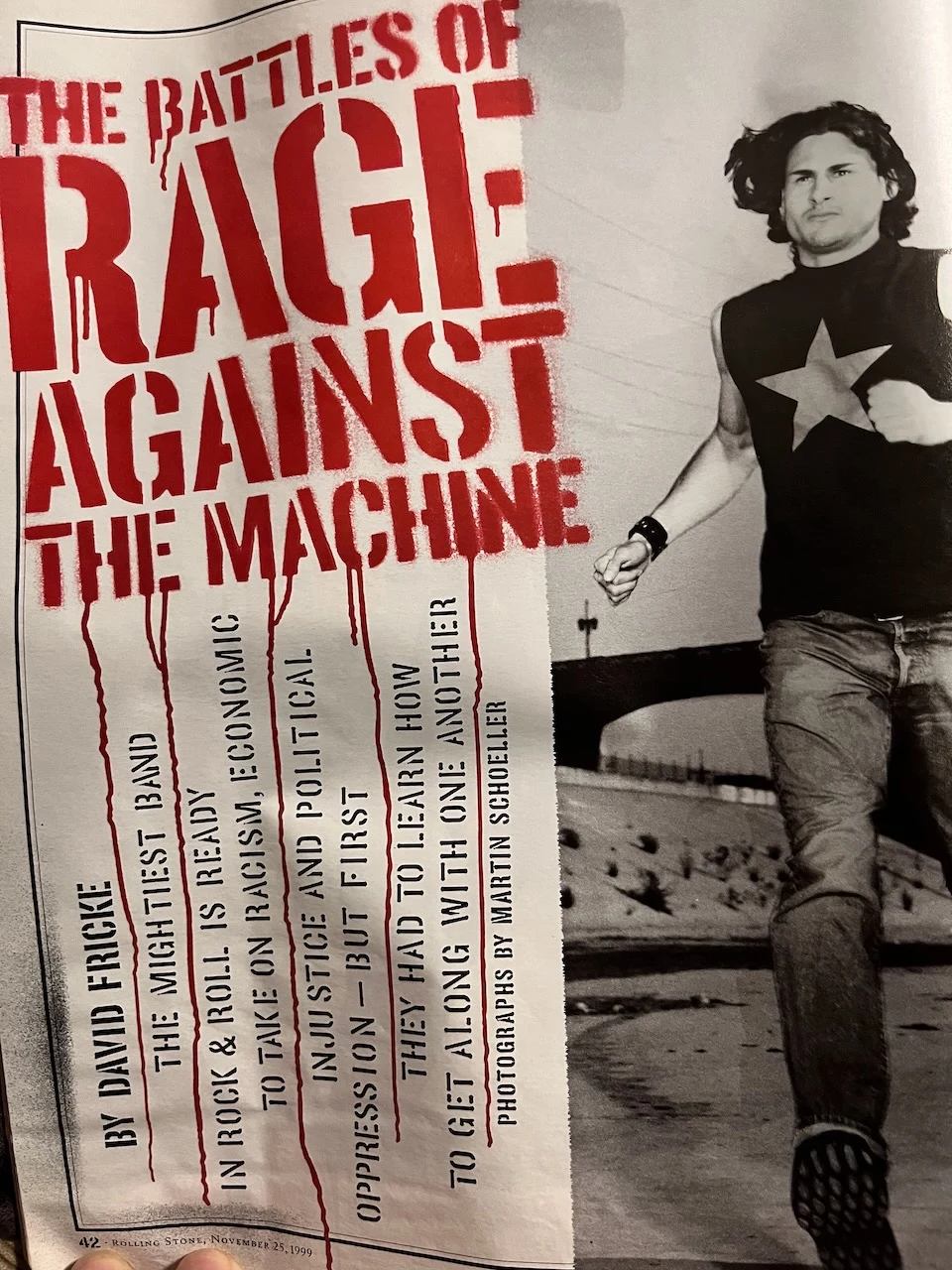
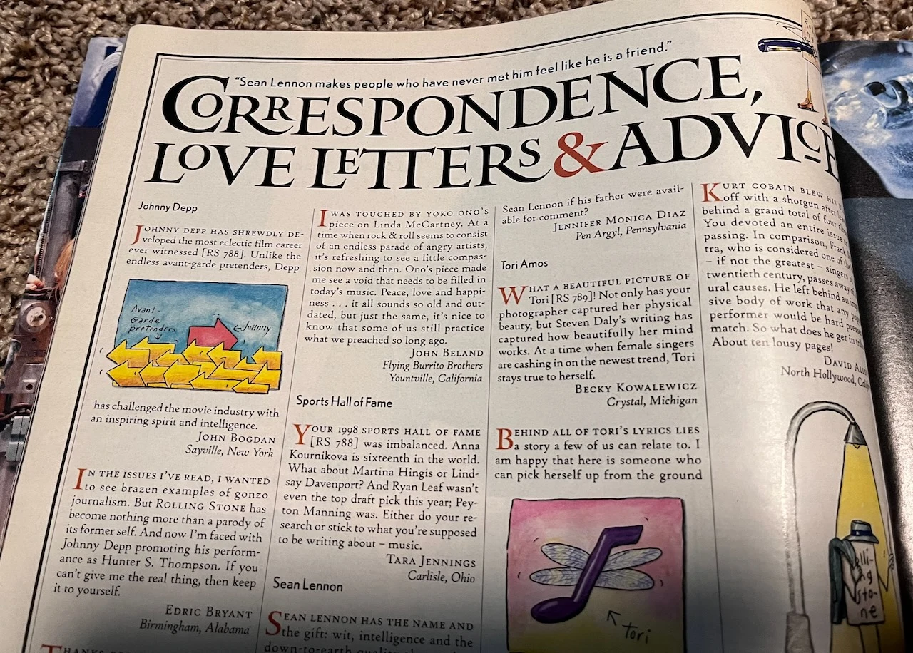
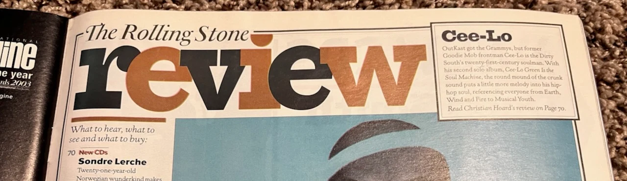
I’ve had those magazines since I was a teenager. The book is, of all things, about Putin. I spotted it in a bookstore and liked the cover design.
I often snap pictures of books, posters, billboards, album covers, movie titles, or anything else I like that I can draw inspiration from later.
I wanted to emulate the typography and funky layouts from the late ’90s music magazines: big condensed headlines, halftone photos, small type packed in around big type. And I decided to keep my red-and-black color scheme.
Three directions
I used Grok Bot for much of the initial design work. I hadn’t used it for design before. It was surprisingly good and pretty fast too. After I gave it the references and answered a series of questions, it built three homepage mockups using my real posts.
| Quiet | Editorial | Loud |
|---|---|---|
 |
 |
 |
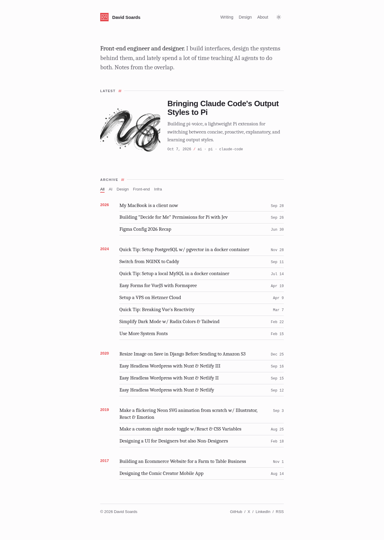
- Quiet: a narrow column, one featured post, and an archive grouped by year.
- Editorial: a black nameplate, a large featured post with three cards under it, and mostly full-color images.
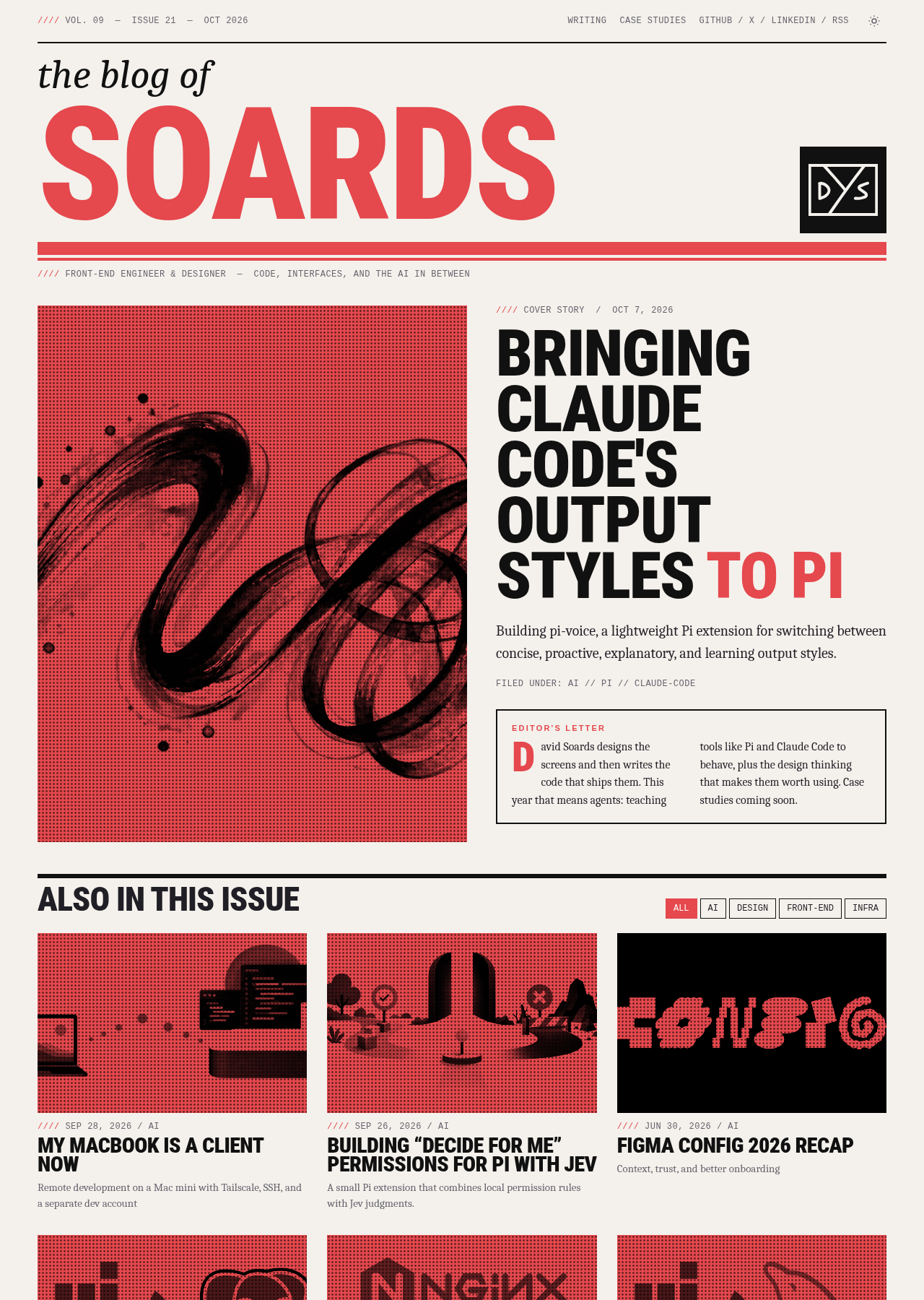
- Loud: a huge red SOARDS nameplate, a tall red-and-black halftone cover image, an all-caps cover story, and a grid of red thumbnails.
All three were pretty good. Minimal was another style I was considering, and the editorial version was a nice middle ground. The loud version was fully inspired by music magazines, and it was my favorite. I wasn’t trying to play it safe on a personal site.
Two details came directly from the reference photos. The red-and-black halftone on the post thumbnails came from the Putin book cover. The monospaced captions, with their runs of forward slashes (// and ////), came from the geeks article.
Losing the impact, then getting it back
At first I thought the masthead and cover headline of the loud version took up too much space above the fold, so I changed the layout to be more like the editorial version and moved the editor’s letter above the cover story. I switched the headings to lowercase Anton and picked Literata for the body text instead of system fonts. After a few rounds, the mockup looked like this:
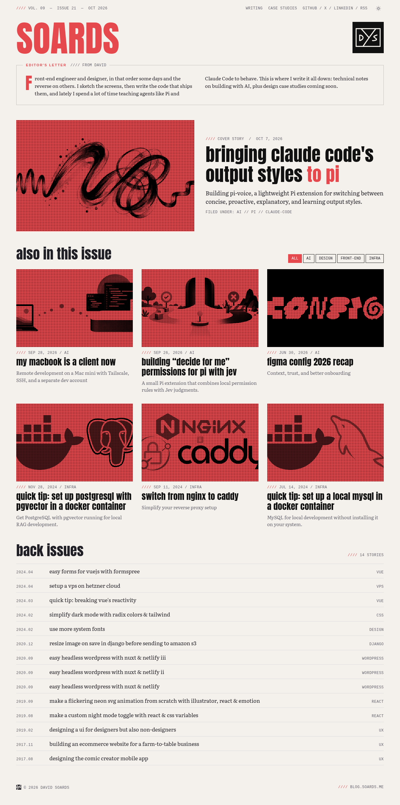
I attempted to have Grok Bot kick off a cloud agent in Cursor to implement the code, but that didn’t work out too well. It overcomplicated everything and kept stopping on every turn. Eventually I started over in Codex with GPT-6.1-Sol and a fresh prompt.
Once the initial implementation was finished, I returned to Cursor in order to use Opus 5.5 for revisions. It was at this point I decided that we had lost some impact compared to the original loud layout. I brought back the large nameplate, with a small italic first name above it.
The top right corner was mostly empty, and that’s prime screen real estate, so I added an “Inside this issue” section with a list of recent post titles.
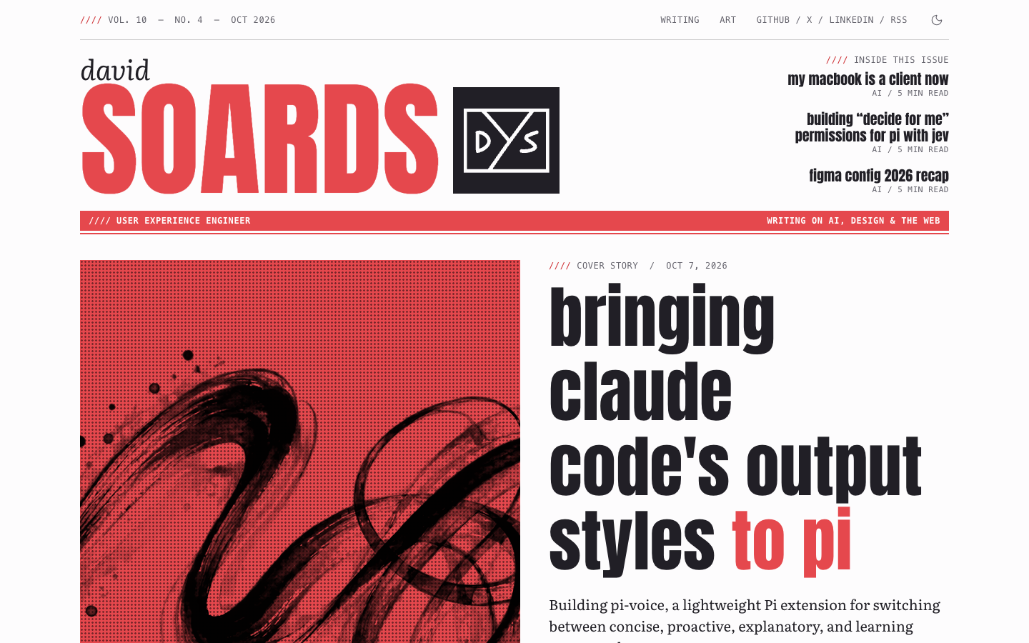
The homepage at this stage of the redesign.
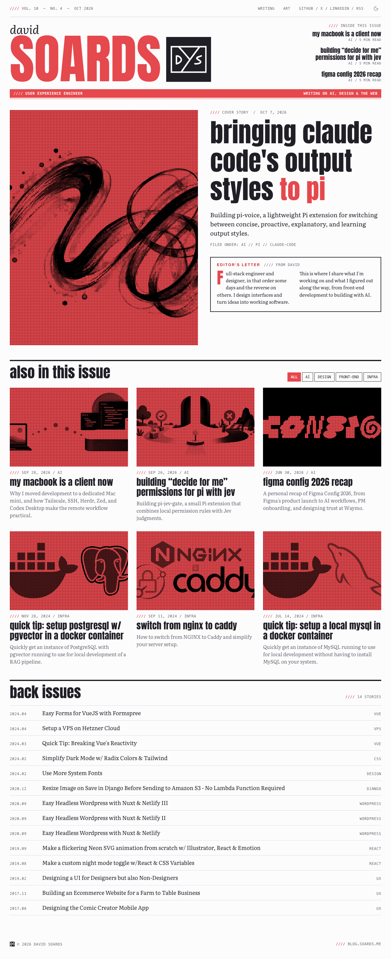
This version was a lot closer to the original loud mockup than the one I’d shrunk it down to. The nameplate looked more like a logo, and the latest post got the full cover story treatment with a large image and headline.
I decided to use all lowercase headlines instead of all caps like most of the references. And I liked the warm paper background in the original mockups, but ultimately went with pure white to take full advantage of Radix Colors. Its text and background colors are designed to work together for accessible contrast.
Before and after
The old site and the redesign use the same posts, but the new layout gives them a different presence. The latest post gets a cover story, more stories appear in the cover lines and image grid, and the older posts stay in a compact archive.
Before
After
Gather your own references
Collect inspiration from wherever you find it, in print or on the web. Pick out what you like from different sources and combine those ideas into something new. The magazines and book cover were my starting point for this site. Yours could look completely different.
Thanks for reading!